Today’s goal is the login/logout flow which you can see on the gif!

When I was building an application it was always hard to deal with login flow. From the navigation point of view, from a user point of view, from the clean code point of view.
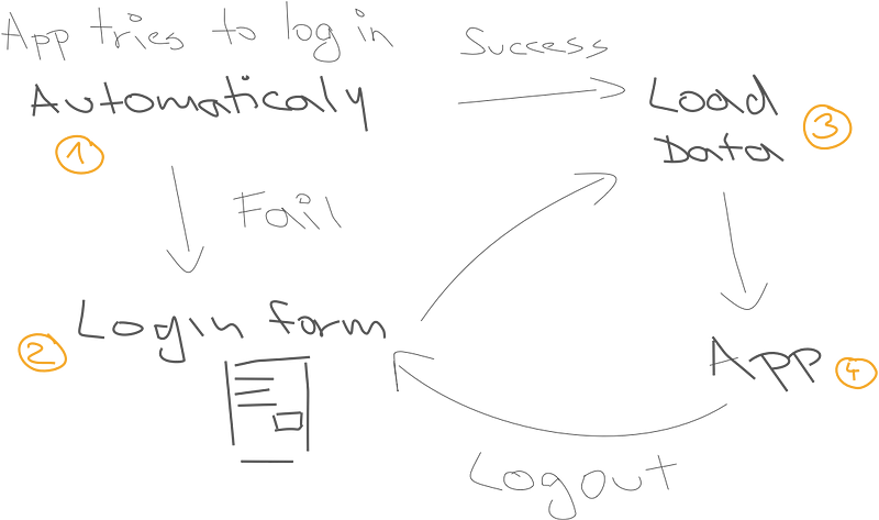
If the user previously signed up to the app it should try to log in automatically (1). So the user doesn’t have to do anything. If it is a new user the application should render login/signup form (2). So the user can create an account. Then we usually want to get some data (3). Prepare the app to use. And finally, we can render the app itself (authorized part of the app).
Use navigation
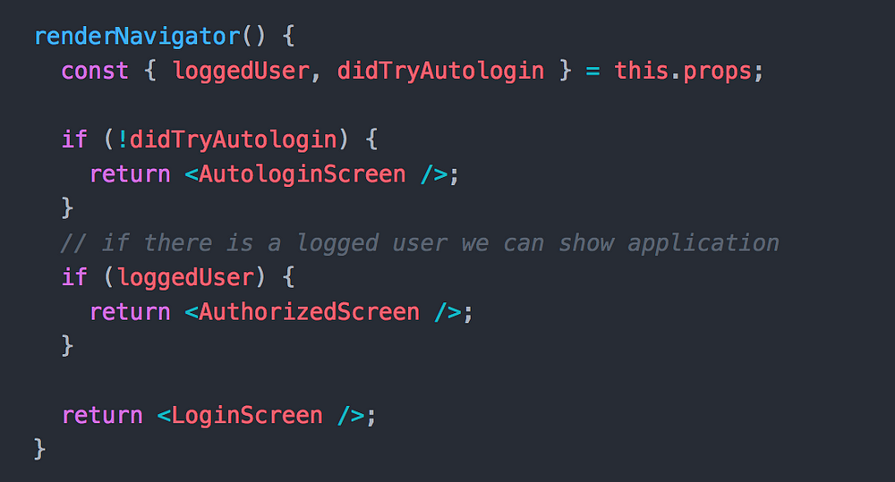
I usually use react-navigation as a navigation library. For me, every single step is separated from each other and written as a page/screen. So if I have a bigger onboard flow I can add or remove the step very easily. Below, you can see the code of login flow controller (guys call it Switch in react-navigation). It is very simple approach how to render particular page when the redux state was changed. This controller is always mounted. So if we want to logout user, we can just set loggedUser variable to null in redux store and this controller will render LoginScreen. Easy and clean!
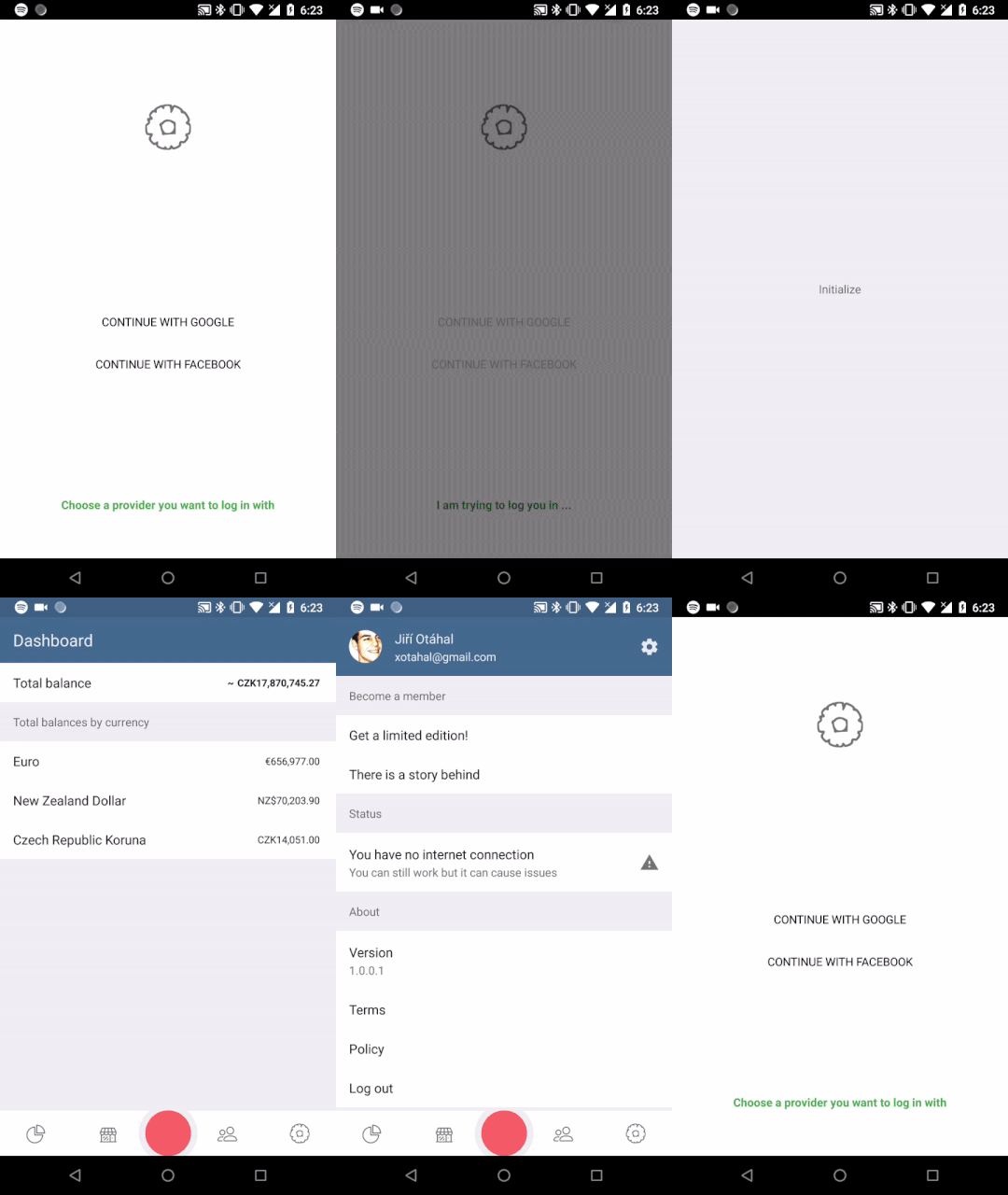
So at this stage, we have a clean code and clean navigation. But the user will see just flickering screens (like on the gif below). We actually don’t know how long those screens will be visible. It can be only 100ms. So every 100ms React renders a new screen. The user could be confused here. I wanted to do it smoothly and understandable. I decided to cover all those screens by only one screen with the logo of application.
How is it done?
It is so simple that there is no need to show the code. There is a redux store variable which represents the Y position of the cover screen. If the variable is set to zero the component completely covers the application and if the variable is set to - window.height the component is out of the screen — so the user can see the application. Easy, right?
Note that we are using useNativeDriver so the animation won’t block JS thread!
Logout Animation
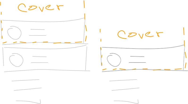
There could be someone who is confused by logout animation. Because I said that the cover screen is completely out of the mobile’s viewable area. So if we animated the cover screen from there it would look like on the picture below.
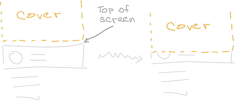
The header would be covered by the cover screen during the animation (right part of the picture). Which is not what we want to do. So before the animation itself, we render exactly the same header on a bottom of the cover screen. Then we have to find out where the header’s bottom position is (status bar height + height of header). Once we know the position, we can use setValue on AnimatedValue and set the position of the cover screen immediately (without animation — right part of the picture below). After this, we can animate the cover screen down as usual.
Logout is in progress
The last animation we are going to talk about is how to clarify the progress of logout process. I decided to use this animation because it looks like it is actually forgetting the user (he is disappearing).

It is simple opacity animation with some rotation on the right settings icon. The most interesting is the text. Someone could think it is done by setTimeout or by something similar. By it’s not. We actually listen to the progress of opacity value. For example, if the opacity is in the middle (value 0.5) the code will looks like this.

It is a good approach how to do that because we can use all advantages of Animated class. For example, we can use a different easing. So it won’t be linear. Another bonus here is that it will finish at the exact same time as the opacity animation.
Note that we have to do nothing during the animation, because it is done by JS thread. So we probably want to use InteractionManager here.
Check it out in the Savee.io
I wanted to build kind of playground for my animations and these articles. So I decided to build Savee — Financial Manager. During only 22 days, I have done iOS version, Android version, website presentation and wrote a How I built profitable application faster than found new job! about that. Can’t say how much I enjoy this time. You should try it as well! If you want to support these articles (and me) you can buy the Pineapple. Just $2.99 a year. Nothing for you. Big motivation for me! Thank you 🙏
Did you like it? Clap, Comment, Share and Follow me! 👏
Actually you don’t have to do anything of that. But it will help me a lot. It’s a big motivation to the next work. Next articles like this for you guys.
About me 👦
I am an author of Savee.io (which I also use as a playground for my animations 🤷). I open-sourced react-native-material-ui and react-native-motion libraries. Writing about them in this blog.
If you need a help with your React Native app (animations, performance, etc.), let me know, please ;) I will be happy to discuss it.

